


UX/UI | Android, IOS | JUN 2018 - NOV 2018
Beauty Angel
Multi-Brand Mobile App UX Case Study
Beauty Angel is a multi-brand mobile app developed for Amorepacific Luxury Brand Division, integrating Sulwhasoo, Hera, Amorepacific, and Primera into a unified customer experience.
The project focused on improving usability while maintaining premium brand consistency across multiple luxury brands.
Timeline : June 2018 - November 2018
Platform : Android, IOS
My Role : In-house App Designer (Brand-side UX Lead)
My Role
I worked as an in-house App Designer, collaborating closely with an in-house Product Manager and an external app development agency.
While the PM owned overall project coordination, my responsibility was to review, guide, and validate UX/UI decisions, ensuring alignment with brand standards, usability, and user experience quality.

Key Responsibilities
-
Reviewed UX/UI outputs from the external app agency
-
Provided UX feedback in collaboration with the in-house PM
-
Validated information architecture and navigation structure
-
Ensured consistent UX across four luxury brands
-
Translated internal brand and business requirements into UX feedback
-
Conducted UX and design quality checks before final release
Design Goals
Defined UX principles to balance brand identity and usability across four luxury brands.
-
Create a unified UX system across multiple luxury brands
-
Improve content discoverability without compromising brand identity
-
Reduce navigation complexity in high-frequency user flows
-
Support both customer-facing and in-store staff use cases
Construction

Design Process

Service Ecosystem Perspective

The UX was designed to support three interconnected user groups:
-
Customers: product discovery, loyalty benefits, and engagement
-
In-store staff: faster consultation and brand communication
-
Brand teams: consistent digital representation across brands
I ensured that each user group’s needs were clearly reflected in the UX structure and interactions.
UX & UI Direction
Focused on reducing cognitive load while preserving premium brand expression.
Unified navigation and layout structure across brands
-
Limited navigation depth to two levels to reduce cognitive load
-
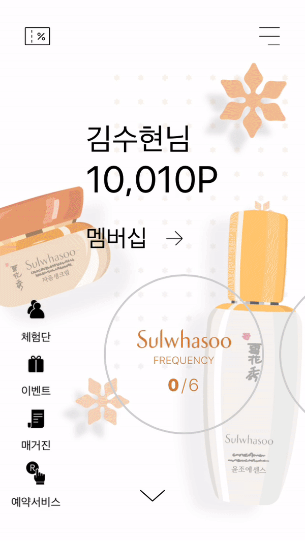
Improved access to high-frequency features (e.g. My Page, Membership)
-
Ensured usability without compromising luxury brand identity
Navigation & Menu Structure
-
Simplified navigation to reduce cognitive load
-
Limited depth to a maximum of two levels
-
Improved access to high-frequency features (My Page, Membership)
-
Reviewed category and brand grouping for clarity and scalability
Core Features Reviewed
-
Integrated product search and discovery flows
-
Review visibility at both list and detail levels
-
Unified review UI across product detail pages
-
Improved purchase transparency with digital receipts
Engagement & Retention UX
-
Daily engagement mechanics (attendance, mini-games)
-
App-exclusive events and promotions
-
Brand service booking flows (counseling, makeup, scalp care)
-
UX clarity for reward-based interactions
Admin Dashboard (UX Review)

Reviewed UX for an internal dashboard used by brand managers to:
-
Monitor promotions and campaign performance
-
Track participation and engagement metrics
-
Manage brand-level content efficiently
Outcome & Impact

-
Improved UX consistency across four luxury brands
-
Reduced navigation complexity and user confusion
-
Established a scalable multi-brand UX framework
-
Strengthened collaboration between brand teams and external developers
What This Project Demonstrates
-
Brand-side UX leadership
-
Experience collaborating with external agencies
-
Strong information architecture and system thinking
-
Ability to balance brand identity with usability
In-house app designer responsible for UX review and design quality, collaborating with an in-house PM and an external agency on a multi-brand luxury mobile platform.
Brand System & Visual Extensions

A modular logo representing balance, cohesion, and multi-brand integration
Beauty Angel
– Unity Mark

Beauty Angel
– Wing Mark
A typographic logo abstracted from the letter “b,” symbolizing angel wings and approachability.

Brand
Frequency Event
Visual Design
Visual design for brand frequency event campaigns across AMOREPACIFIC cosmetics brands.

Reservation
Service Visual
Content Design
Visual content design supporting reservation-based services for AMOREPACIFIC cosmetics brands.